էս նկարում ի՞նչ ա։ երեւի վրաստան ա՝ չեմ ճանաչում։ #եկեղեցի #վանք #տաճար
 @{ filtergrade (unofficial) ; filtergrade@spyurk.am} 16.09.2020, 0:09:56
The Best Photoshop Blogs with Tutorials & Resources
Learning Photoshop, or anything really, all by yourself is an admirable quest. But eventually, everyone needs to seek out an outside resource like an educational blog in order to advance their knowledge and learn from experts.
In this blog, we’re going to cover some of our favorite Photoshop blogs where you can get awesome tutorials and resources. Cover photo by: Matt Moloney
Best Blogs to Learn Photoshop
1. FilterGrade - Our Personal Favorite Blog ;)
Read here
Of course, we have to mention ourselves! Here on FilterGrade, we cover a lot of topics related to photography and editing. Our selection of Photoshop tutorials and guides cover a lot of ground from individual effects tutorials to general usage guidelines. We take a photography-centric approach to our education, but that doesn’t mean we don’t appeal to graphic designers and general users as well. Our team of writers is made up of Adobe Creative Cloud experts who have used this software for years and known the ins and outs as good as anyone. We also have a ton of freebies as well as purchasable Photoshop actions to accelerate your design. Finally, we also have a YouTube channel where we have turned some of our written tutorials into video guides.
2. Design Crowd - Best Blogs for Design Education
Read here
Design Crowd, formerly Worth1000, has a great blog about design. It’s not necessarily focused on Photoshop, but rather design in general. Their blogs are fantastic for anyone trying to get into using Photoshop or any other design program. There is a lot of inspiration in terms of logo design. Whether its gyms, rock bands, or tattoo shop logos, Design Crowd has an article worth of inspiration for you! We would love it if they had more tutorials rather than just inspiration, but sometimes inspiration can be as critical to using Photoshop as anything else.
3. Tutsplus - Best Photoshop Blogs for Actions
Read here
Tutsplus by Envato provides a lot of great effects tutorials, freebies, and lists of additional resources. These tutorials tend to be specific effects that are a lot of fun to create and can really a design special if used right. Their massive backlog of content will keep you busy for a long time. They have a major focus on Photoshop actions, which can help to accelerate your workflow by automating certain tasks. Many of their specific effects include accompanying videos so you can follow along easier.
4. Photoshop Tutorials - Best Blogs for Photo Manipulation
Read here
If it has “Photoshop tutorials” in the name, it must be good, right? That is definitely the case with this blog, as it provides a lot of hyper-specific photo manipulation and compositing tutorials that will leave you with useful lessons. Sure, maybe you don’t need to create an image of a secret temple above the clouds, but you’ll still be able to learn a lot about compositing multiple items, color correcting a scene, and masking objects. While some websites focus more on logos or typography, this blog shows the true extent of Photoshop’s tools to reimagine existing images. Their tutorials are packed with detail and are easy to follow.
5. Adobe - Best Photoshop Tutorials for Beginners
Read here
Adobe themselves have their own set of Photoshop tutorials that you will find useful. While it’s not quite a blog you can subscribe to, this is a necessity for all Photoshop users. Most of the tutorials are easy-to-follow videos, but often have text transcripts. Their beginner tutorials are perfect for learning the basics or learning a brand new feature. Their more advanced tutorials are handled by partners. These partners are designers and experts entrusted to create tutorials for the community. While learning from third-party sites may give you insight into more advanced effects, getting information straight from the source is absolutely necessary for learning the fundamentals!
6. The Photoshop Subreddit - The Best Place to Ask Questions
Read here
You won’t find too many direct tutorials on the Photoshop subreddit, but you will find a lot of great questions, and the opportunity to ask your own of the community. There is also a weekly thread for showcasing your work and getting critiques from fellow designers. The sense of community and constructive feedback is sure to make you a better designer. Even if you’re following tutorials or expert blogs, it’s hard to know if what you’re doing is good or not. Just be open and willing to learn, and take recognize that everyone will have a different opinion.
7. Photoshop Cafe - Best Photoshop Blogs for Practical Skills
Read here
Photoshop Cafe is a fantastic collection of practical tutorials. Rather than focusing on creating specific scenes, Photoshop Cafe’s posts tackle everyday effects that you can apply to many of your designs. Whether its lighting objects, removing backgrounds from photos, or how to customize your workspace, you’ll find a skill here that you can apply to more than just one project.
8. Hubspot’s “How to Use Photoshop” - A One-Stop Source for Beginners
Read here
Okay, this one is only one blog post, and not an entire blog website. But Hubspot has an excellent blog all about the basics of Photoshop and how to get started. It also has a place to download an even more in-depth guide called The Marketer’s Guide to Photoshop. Hubspot does have a lot of well-written articles about Photoshop and how to use it for many of the things a marketer may use Photoshop for. So once you’re done with this article, try searching “Photoshop” on the Hubspot blog to find even more great resources.
9. Vandelay Design - Best Roundup Lists
Read here
Vandelay Design is dedicated to providing design education to everyone, and does a great job with their blog. They cover more than just Photoshop but have an extensive catalog of Photoshop content. While there are plenty of tutorials, they also have roundup posts of tutorials dedicated to specific effects, so you can find exactly what you’re looking for without having to hunt around. Sometimes these roundup posts gather tutorials that would be buried underneath search results otherwise, and you’ll probably find a diamond in the rough.
10. Julieanna Kost’s Adobe Blog - Perfect for Intermediate Designers
Read here
Adobe has a lot of approved bloggers that create content on their website. There are many great ones to choose from, and one standout is Julieanna Kost. Her Photoshop posts cover how to use useful tools and how to make your workflow more efficient. This is probably ideal for intermediate users, who know the basics and are aware of some more specific or advanced features but haven’t tried them out yet. Many of Julieanna’s posts are actually video tutorials, so settle in for both some reading and listening.
Everything you need to become a Photoshop expert is out there on these blogs and more. From the absolute basics to advanced and specific tutorials, there is a huge wealth of knowledge you can find. The key is practice! Even if you see a tutorial that doesn’t catch your interest, it will be worth trying it out just so you can potentially learn new skills. If you want to share your favorite Photoshop tutorial or effect in the comments below, please do, and let’s all learn together!
Read next: Top 10 After Effects Blogs in 2020
The post The Best Photoshop Blogs with Tutorials & Resources appeared first on FilterGrade.
#design #inspiration #photoediting #photography #photoshop #resources #art #best #blogs #cameraraw #education #freebies #howto #learn #news #tips #tricks #tutorials posted by pod_feeder_v2
i have showed these tiles back a couple of years ago. this time the tiles have been spotted at the remote village farm. i asked where they did get the tiles, and they answered that someone brought those from an old factory.
other places i spotted those - nissan service in yerevan - i guess they did not change anything, just use the old industrial building, and tapastan cafeteria on sarian street in yerevan.
btw, tapastan[տապաստան] is a wordplay - they refer to tapas, so it is a land of tapas (stan is an old persian suffix for a place or country) and, tapastan (but not with p[պ], but p’[փ], like in paris) means desert.
 @{ Կողմնակի Անցանց Մ․ ; norayr@spyurk.am} 01.09.2020, 18:04:44
արդէն գրել էի այս սալիկների մասին։
ահա, հարցրի ո՞րտեղից՝ ասին ծանօթ ա բերել ինչ֊որ գործարանից։
#յատակ #դիզայն #սալիկ
#tiles #tile #industrial #indusrial-design #industrial_design #design #interior #interior-design #interior_design #history #yerevan
this is a very good blog post՝ back to basics about strings in C and Pascal. i suggest you to read it, and now i’ll tell you something else:
in Oberon, Wirth decided to give up on Pascal strings, and use zero terminated strings.
however, there is no need to run by the whole array to find out the length of the string. we don’t even need to have a separate field that holds the length՝ compiler knows the length of the static string.
thus it can do compile time tests. for example we have the following Oberon source՝
MODULE tst;
IMPORT Out;

VAR i: SHORTINT;
str: ARRAY 1024 OF CHAR;

BEGIN

FOR i := 0 TO LEN(str) DO
Out.Int(i, 0); Out.Ln
END;

END tst.
lets try to compile it՝
[2020-09-02 16:00:20] $ voc -m tst.Mod
tst.Mod  Compiling tst.

9:   FOR i := 0 TO LEN(str) DO
^
pos   102  err 113  incompatible assignment

Module compilation failed.
[2020-09-02 16:00:21] $
voc compiles Oberon source to C, which is very good to illustrate what happens. if we have՝
str: ARRAY 16 OF CHAR;
then the output C code will be՝
static CHAR tst_str[16];
nothing more։ no field for the length.
still, this՝
FOR i := 0 TO LEN(str) DO
will translate to՝
tst_i = 0;
while (tst_i <= 16) {
as i said we know the length at compile time. doesn’t matter if you generate C or assembly, you already know the number, you can put the number to the output assembly code as well.
when we write a function which receives strings, we should not knowt the length of the received string, we just use ARRAY OF CHAR as an argument՝
MODULE tst2;

PROCEDURE addStrs(VAR a, b: ARRAY OF CHAR);
BEGIN
(* do smth useful here *)
END addStrs;

PROCEDURE test*;
VAR
s0: ARRAY 32 OF CHAR;
s1: ARRAY 64 OF CHAR;
BEGIN
addStrs(s0, s1);
END test;

END tst2.
therefore C code will be՝
static void tst2_addStrs (CHAR *a, ADDRESS a__len, CHAR *b, ADDRESS b__len)
{
/* here we think we can do smth useful */
}

void tst2_test (void)
{
CHAR s0[32];
CHAR s1[64];
tst2_addStrs((void*)s0, 32, (void*)s1, 64);
}
as we see՝ the function also gets the length of strings. and if we do LEN(a) we get the length without any calculations.
now let’s see how dynamic strings work՝
MODULE tst3;

PROCEDURE addStrs(VAR a, b: ARRAY OF CHAR);
BEGIN
(* do smth useful here *)
END addStrs;

PROCEDURE test*(i: INTEGER);
VAR
s: ARRAY 32 OF CHAR;
ps: POINTER TO ARRAY OF CHAR;
BEGIN
NEW(ps, i);
addStrs(s, ps^);
END test;

END tst3.
now we hase a static string՝ s and we allocate a dynamic string with its pointer ps.
lets assume we don’t know the size of ps^ string (^ means dereference) and we will receive the length of the allocated string as a function argument. it is not known at compile time.
first function remains unchanged, second function gets translated like this՝
static void tst3_addStrs (CHAR *a, ADDRESS a__len, CHAR *b, ADDRESS b__len)
{
/* do smth useful here */
}

void tst3_test (INT16 i)
{
CHAR s[32];
struct {
ADDRESS len[1];
CHAR data[1];
} *ps = NIL;
ps = __NEWARR(NIL, 1, 1, 1, 1, ((ADDRESS)(i)));
tst3_addStrs((void*)s, 32, (void*)ps->data, ps->len[0]);
}
the _NEWARR is a bit more complicated function, which is a part of the runtime.
but we can understand what it does՝ it allocates a space in the heap, and the pointer ps we get now points to the struct, which has a data field and len field.
this is a runtime information, and in this case we have to keep a separate field for the length of the string.
that’s it.
#oberon #c #pascal #wirth #programming #programming-languages #programming_languages #design #implementation #vishap #voc #compiler #compilation #strings #string #heap #stack #storage #storage-management #storage_management #length
these are old industrial tiles, now i have encountered on a remote village farm. i asked where they got those tiles, and they said - someone brought from the old factory.
tiles like that i also saw in nissan service centre in yerevan - they rent an old factory, first i saw the tiles at the “tapastan” cafeteria on sarian street. i’ll publish a photo from there too.
 @{ Կողմնակի Անցանց Մ․ ; norayr@spyurk.am} 01.09.2020, 18:04:44
արդէն գրել էի այս սալիկների մասին։
ահա, հարցրի ո՞րտեղից՝ ասին ծանօթ ա բերել ինչ֊որ գործարանից։
#յատակ #դիզայն #սալիկ
#tiles #tile #industrial-design #industrial_design #design #yerevan
first they have had dismantled the asbestos roof, now only the walls remained. and we can see how the walls were painted.
 @{ Կողմնակի Անցանց Մ․ ; norayr@spyurk.am} 01.09.2020, 17:39:30
էս տունը քանդել են ու ներկած պատն երեւում ա։ի դէպ քանդելիս հնդիկներ էին աշխատում՝ մեր փայ միգրանտները։
#շէնք #պատ #դիզայն
#building #wall #design
https://www.archdaily.com/943939/suburban-sprawl-increases-the-risk-of-future-pandemics
#sprawl #pandemics #future #city #design
It’s not just endlessly reinventing the wheel, it’s often dropping the new wheels onto the piles of old wheels underneath. I’ve noticed similar things on Linux where looking for how to set something up in ALSA, I find many forum posts telling someone to just install PulseAudio (I’m yet to find anything that I need to do that PulseAudio can do and ALSA can’t)! The answer to how to solve one simple problem should not be to install an additional layer of complexity over the top of whatever you were using.
https://soylentnews.org/article.pl?sid=20/03/29/1625233
#complexity #alsa #pulseaudio #linux #design
https://www.youtube.com/watch?v=q7ve_i0uXNg
Karen Demirchyan Sports and Concerts Complex,swivel tribune. #yerevan #architecture #design
Third, and this has been touted by others already (and even rebutted), the disappearance of the public web in favor of mobile and web apps, walled gardens (Facebook pages), just-in-time WebSockets loading, and AMP decreases the proportion of the web on the world wide web, which now seems more like a continental web than a “world wide web”.
https://jeffhuang.com/designed_to_last/
#internet #web #design
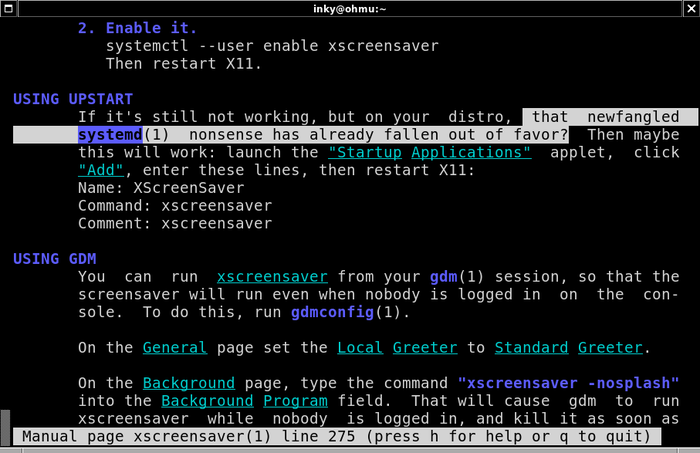
#manual #xscreensaver #unix #linux #systemd #design #screenshot #nonsense
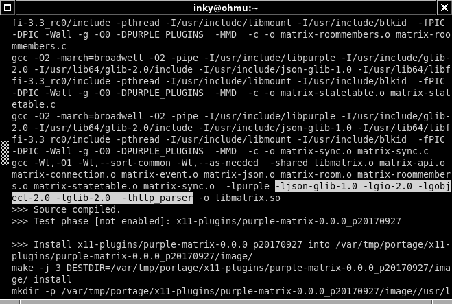
the world went mad: there is trump in usa, putin in russia, and matrix works over http.
#why #screenshot #programming #compilation #technology #matrix #design
Why I use Object Pascal https://dubst3pp4.github.io/post/2017-10-03-why-i-use-object-pascal/
#pascal #programming #article #object_pascal #design
first of all, the article does not mention the most important thing - modules. pascal has modules. modules were introduced to c++ just in 2017. modules are why you can have type checks across boundaries of modules.
and pascal units are modules. if they do those loadable on demand, that would be cooler.
Pascal is very strict, so the programmer has to differ between subroutines that return values, in Pascal called functions, and subroutines that does not return something, called procedures. Functions and procedures can also be passed to variables or other functions thanks to procedural types.
well, in pascal successors the function keyword removed, leaving just one procedure, or to be precise PROCEDURE because Wirth decided to make successor languages case sensitive and decrease the number of lexems.
It is possible to overload operators for specific types. With this feature, you have the power to define, let’s say, the result of the addition operation of two or more instances of the same class.
That’s one of the reasons why Wirth doesn’t like modern pascal implementations. The author tries to say - Pascal has all the features, while Wirth was trying to create a minimalistic language by following “less is more” principle.
Pascal is modular
okay, he said this. but did not connect to the type checks.
Pascal has good documentation
indeed, freepascal.org documentation is good, understandable and comprehensive.
well, for me Pascal today is like ‘better c++’, but why would i need better c++ if i have Oberon?
i will use it to write gui applications, or if i need to write something very fast and i don’t have libraries for Oboren and time to create libraries or bindings.
#pascal #oberon #modula-2 #wirth #design
The Wayland architecture integrates the display server, window manager and compositor into one process. You can think of Wayland as a toolkit for creating clients and compositors. It is not a specific single compositor or window manager. If you want a different window manager, you can write a new one.
I don’t know much about Wayland but the immediate question is: Why would you want to do that? If Wayland has it’s own window manager built in why do you need another one? It’s like support for Windows or OS X. Not needed as those systems have their own window managers and not really support replacing it. This is contrary to X which has no window manager by default and allows and encourages others to implement it. Window Maker is a window manager for X (as stated in the info box) and Wayland aims to be an incompatible replacement of X. So they are not really a good match at first sight.
now, they say - use wayland, it’s a new and good thing. this is a dealbreaker for me. i can’t live without windowmaker.
also, says
If Wayland has it’s own window manager built in why do you need another one?
wait, how? seriously? if there’s a one brand of bread, why would you need another one?
this is centralization again.
#quote #technology #wayland #xorg #linux #unix #windowmaker #design
interesting, important discussion https://github.com/modula3/cm3/issues/42
i think the requestor is right. may be i need tot initialize the array with other values, why spend time to initialize it to zeros?
#programming #programming_languages #modula #modula-3 #design
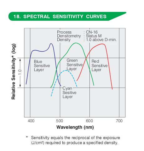
this picture is from the datasheet of superia 1600, which is the same, as i understand, natura 1600.
so what for is the fourth layer? we know the three: red, green, blue. so we see that the fourth layer is sensitive in the area of greens.
now, question: who designed x-trans sensor which contains more green reading elements? fuji, who applied the knowledge from film area to its digital designs.
#photography #design #engineering #sensor #photo #superia #superia_1600 #natura_1600 #film
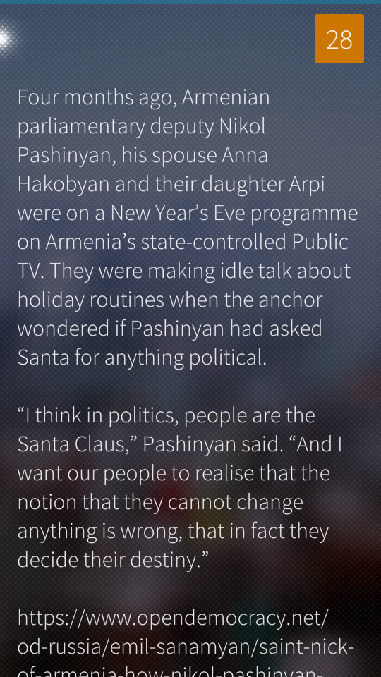
since i know sailfish, it’s even hard to read texts on the internet, because those are either black on the white background, or whitish on the dark background, and all these themes are predefined by the designer.
while i got used that i generate the theme from the picture i like, therefore text can be on a blurred image i have chosen, and the colours are chosen by me, and its not just white on dark or black on white, or whatever.
#sailfish #design #text
A good language design may be summarized in five catch phrases: simplicity, security, fast translation, efficient object code, and readability.
http://norayr.am/papers/Hoare_Hints.pdf #hoare #programming_languages #design #programming #computer_science
microkernel operating systems follow ideas of liberalism. on the contrary, monolitic kernel, is like a leftist idea, where you have big government which has to deal with everything. it can be efficient, though, as dictatorships as well, butif it fails, you’re screwd. microkernel means less central power, not as efficient, but more reliable. #liberalism #operating_systems #os #microkernel #engineering #design

new gimp splash screen. (:
#gimp #splash #design #autumn
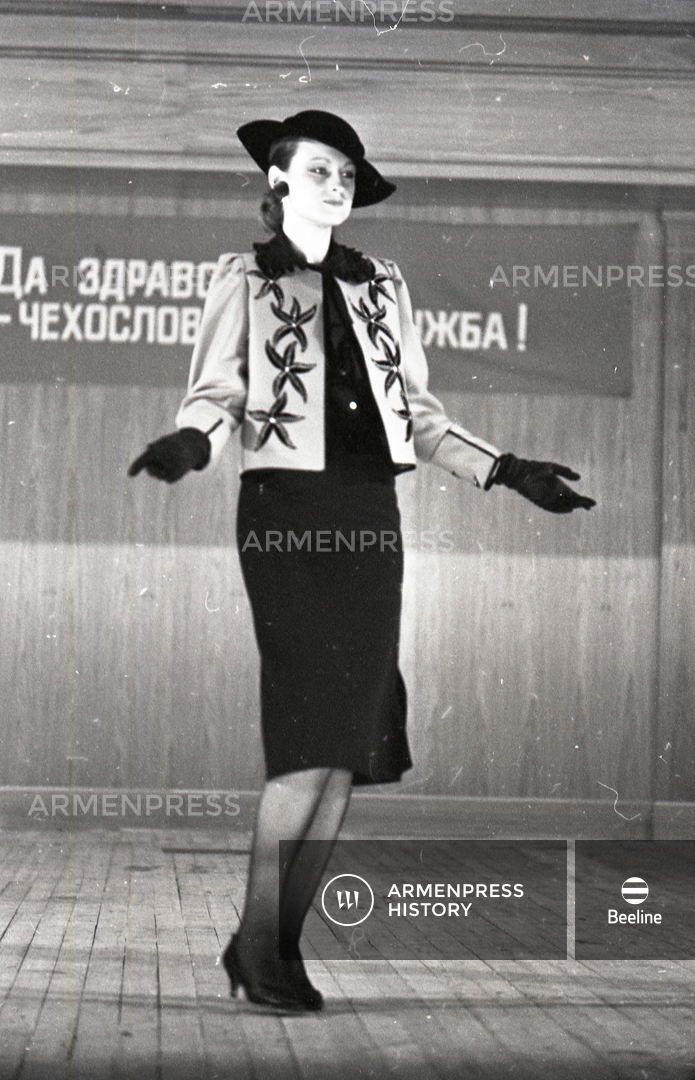
fashion show in in yerevan, 1985.
inscription on the wall says something about soviet-czechoslovakia friendship. i guess the design is from czechoslovakia. note how ‘sad’ everything is, in this try to make something shiny and attractive. this expresses sovietness a lot.
http://history.armenpress.am/photos/5479-նորաձևության-ցուցադրություն.html
#yerevan #ussr #cccp #czechoslovakia #fashion #1985 #design #history #girls
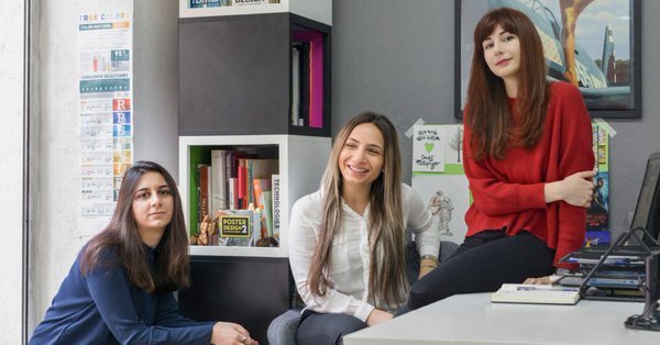
text about one of armenian design companies.
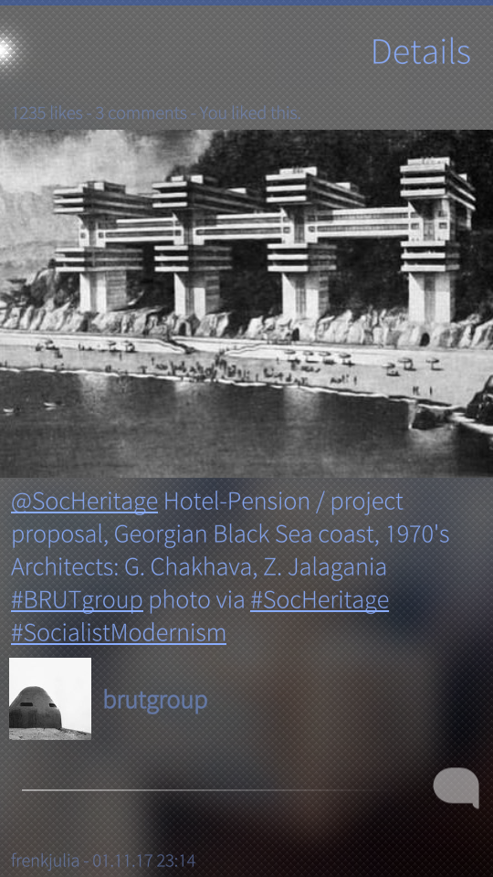
#georgia #architecture #design
i don’t like material design. a also don’t like emboss/3d buttons.
i also don’t like retro. though i like vintage.
i think there’s no sense in making buildings today, like in 17th century. not a good design.
same with the design of the on screen buttons - if they are trying to pretend to be real, have shadow, or look like real, it does not make them real. and emulation/simulation like that is not about good design.
so the ‘back’ button on android. it emulates the phones with keyboards and those legcy interfaces. but why when you have a touchscreen? here jolla approach is much better - you don’t have that ‘back’ button. why would you? no need for that on a touch screen.
see you. #design
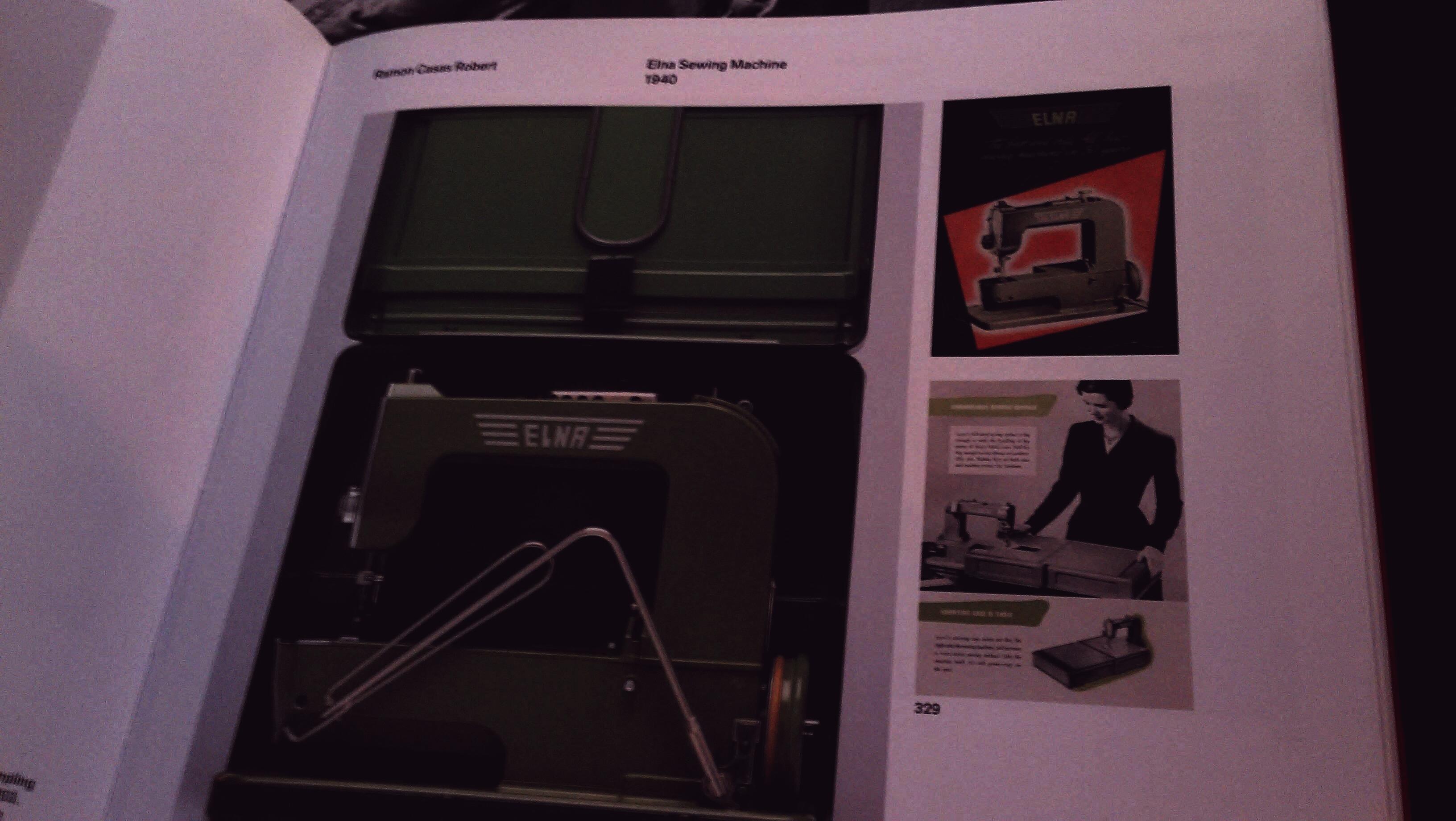
#elna sewing machine, #1940, #design
and the wheel is located below, not where we expect to see it. #green #book
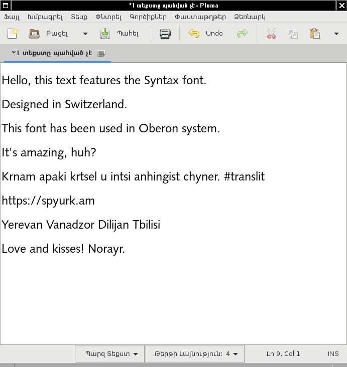
#font #design
you use VAR because you want to get the pointer to the array, instead of copying the whole array to the procedure’s stack.
so the suggestion was that if you want to make sure the array won’t be modified, you use “-” mark.
what about optimizations, they say, that in principle compiler can understand that you did not write to the passed array, and instead of passing it to the procedure by value (by copying the whole array), pass it by reference (by copying only pointer to it).
i disagree, because i believe, it is important to mark your intentions. if you intent to make sure you pass it read-only, you pass it with “-”, if you intent to pass it read-write, you pass it just with VAR. passing with ‘OUT’, when you cannot read it, but can only write to it is not supported in Oberon.
@{Antranig Vartanian ; antranigv@spyurk.am} 01.06.2017, 19:08:27
#oberon #programming #language #design ##
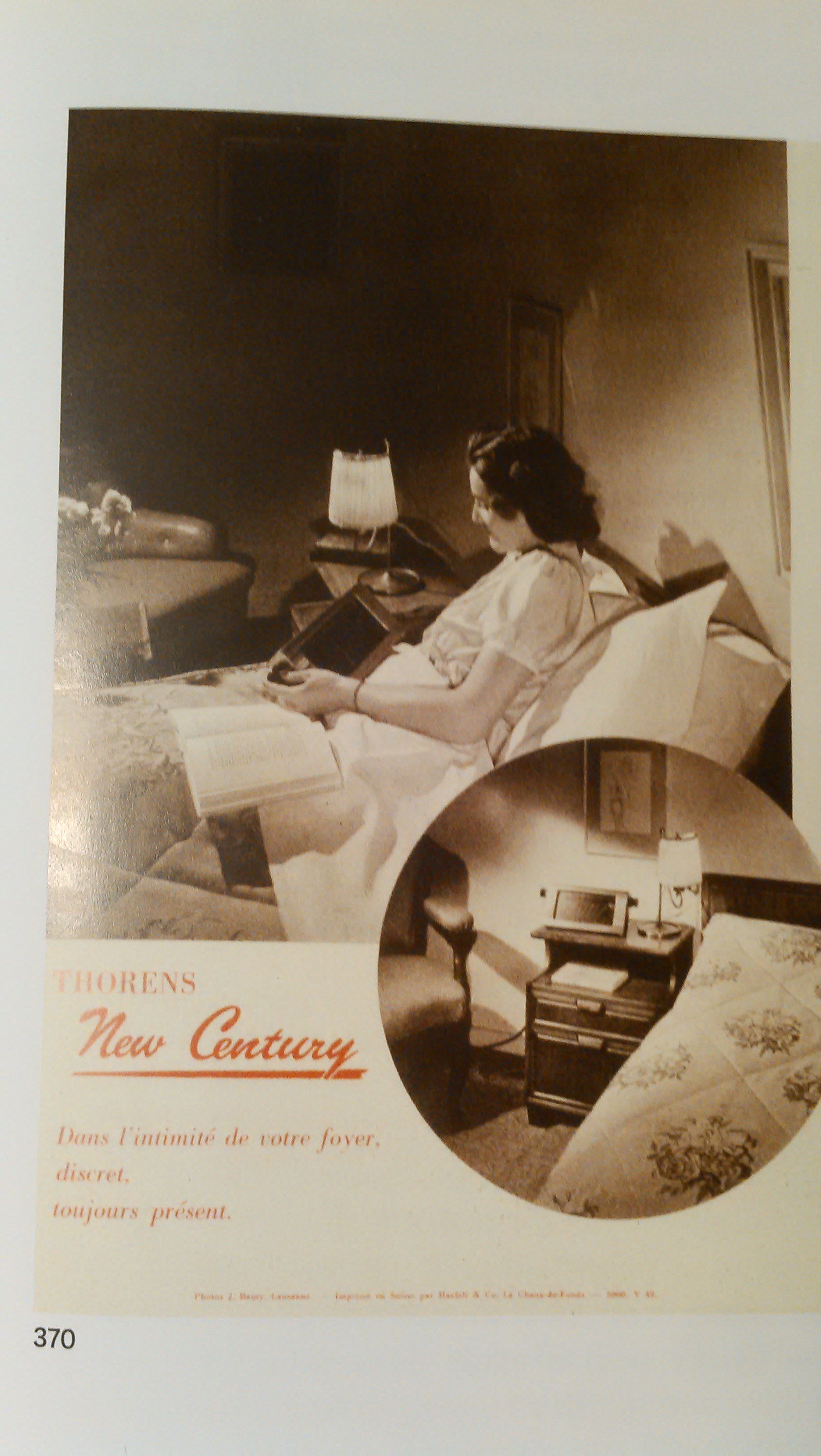
Thorens New Century radio with separate receiver, controls, and speaker. Front and back of prospectus, 1949, Thorens S. A., Saint-Croix. #1949 #design #radio #thorens #saint-croix (սուրբ խաչ , երեւի քաղաքի անուն է)
http://mymodernmet.com/cinema-palettes/ via @{անկապ ; ach94er@spyurk.am} #design #palette #colour
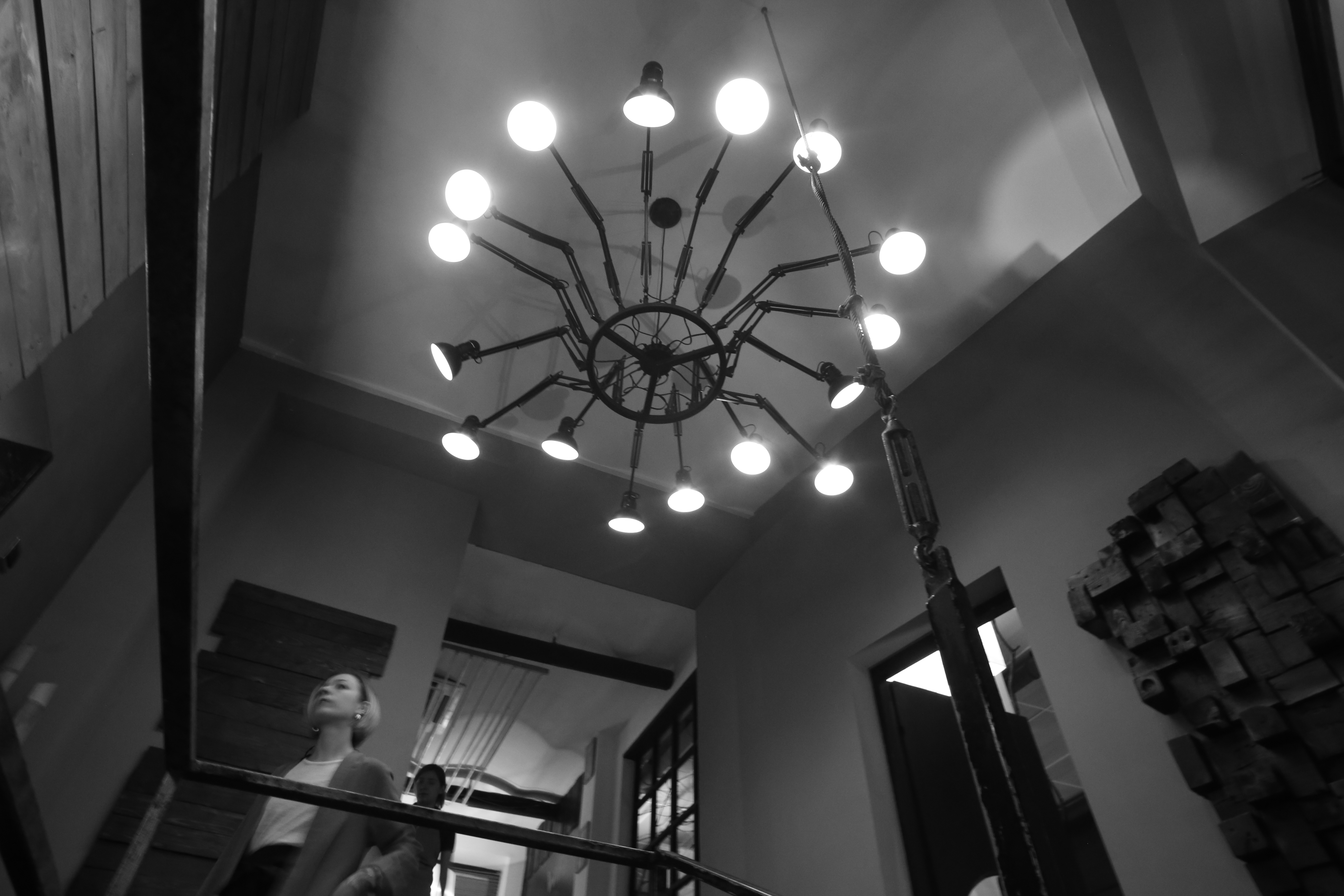
#design
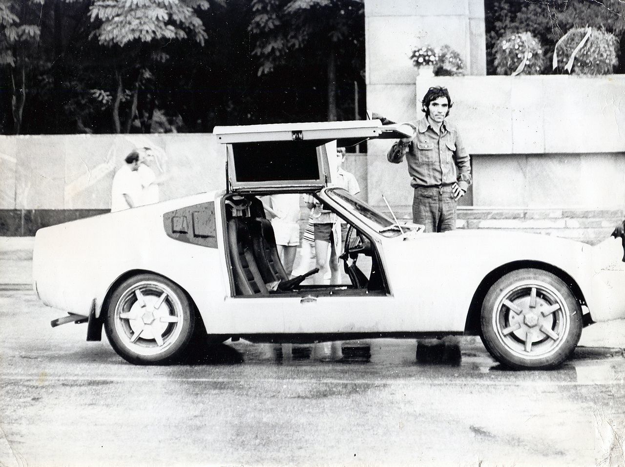
Rafik Ordyan (Armenian: Ռաֆիկ Օրդյան; Russian: Рафик Ордян; September 25, 1948 – May 31, 1979) was a Soviet-Armenian engineer and handcrafter of automobiles, who designed and built the GT-77 race car which went on to capture 1st place in the 1977 Soviet Grand Prix.
http://isralove.org/load/7-1-0-185
#armenia #yerevan #gt-77 #racing #car #design
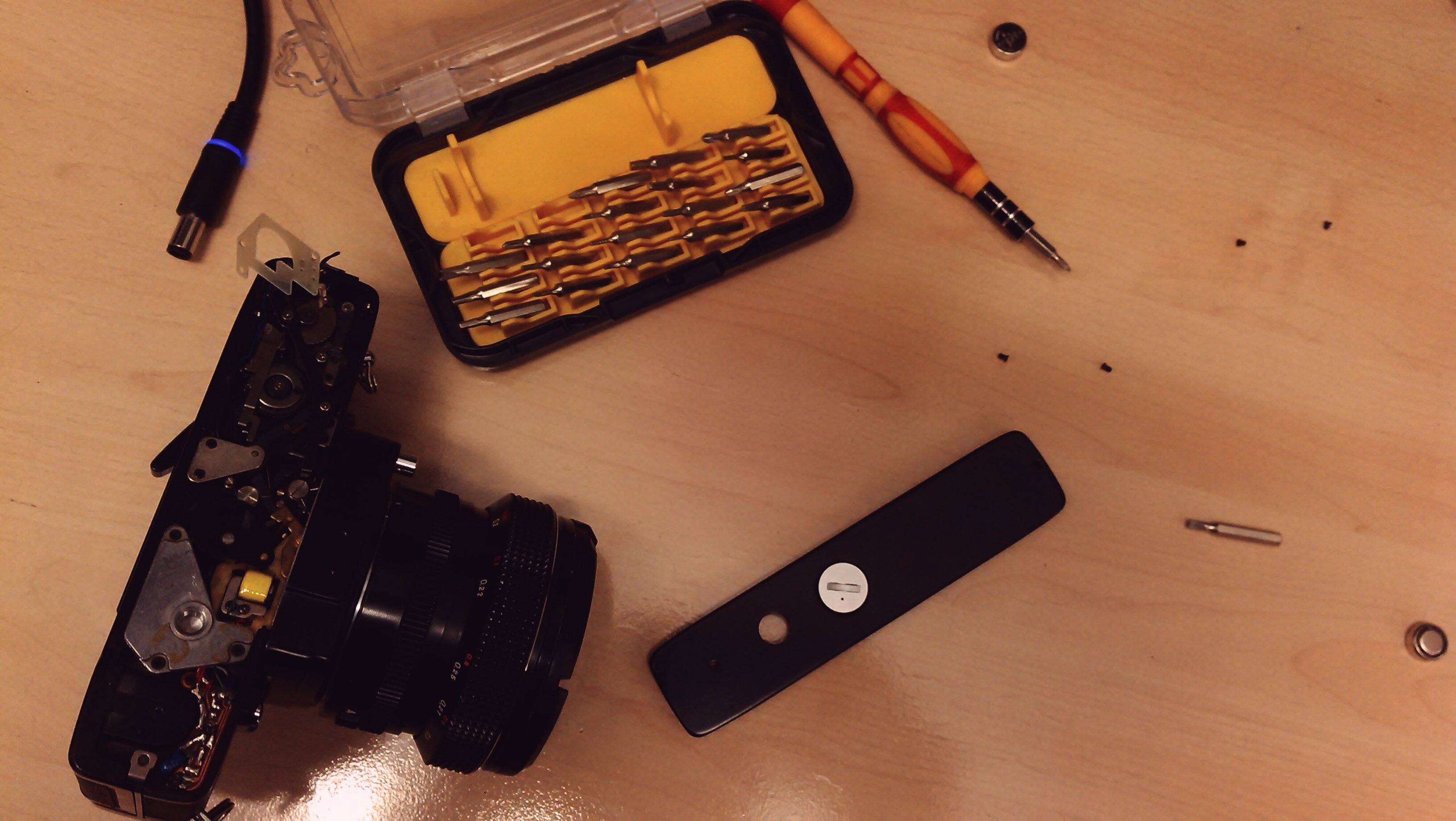
just fixed the stuck shutter of porst compact reflex sp (: because how hard could it be? (:
btw the camera itself is a piece of art. and lightmeter lights panel in the viewfinder with arrows and green led looks quite impressive today.
because good design is out of time. (:
#porst #camera #design

#photo #armenia #door #design
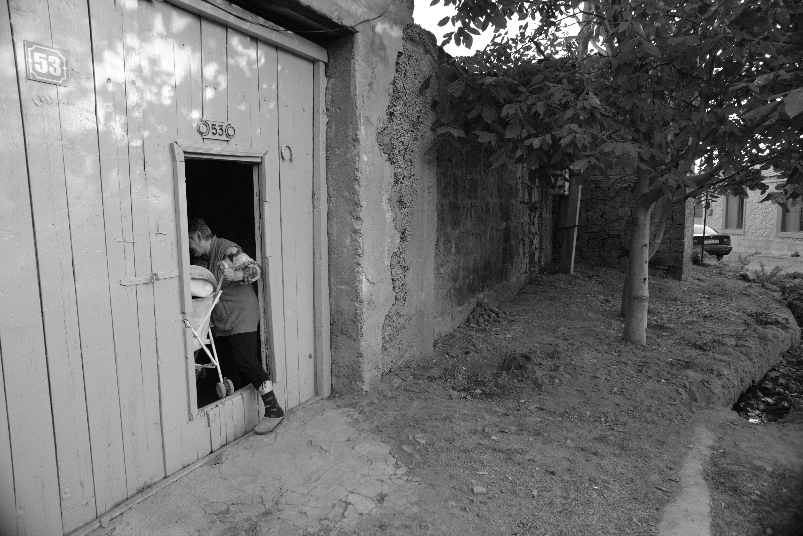
#photo #armenia #town #design #door
so this is an intentional design decision.
The Airbus and Boeing FBW computers design considerations for generic errors… The ELAC is produced by Thomson-CSF using Motorola 68010 processor, and the SEC is produced by SFENA/Aerospatiale using Intel 80186 processor
Airbus (or the DGAC) was not willing to accept that a fault with the same piece of code in two separate computers could cause the loss of an aircraft.
#programming #airbus #boeing #fbw #elac #design
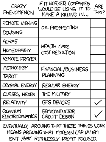
the economic argument
#xkcd #capitalism #remote_viewing #dowsing #oil_prospecting #aura #auras #homeopathy #healthcare #remote_prayer #prayer #astrology #tarot #planning #crystal_energy #curses #hexes #military #relativity #quantum_electrodynamics #gps #semiconductor #design
today’s internet is not decentralized, but multipolar. it has many centers.
it becomes something, which it would become, if there would be no arpanet with it’s decentralized design. it becomes something, which it would become, if usa would not contribute years of research to the public.
there was minitel. if someone remembers it. there were different online boards.
it becomes an universal access to different centers like minitel.
email still works as designed.
who will still use it after several years? #internet #minitel #bbs #decentralization #design
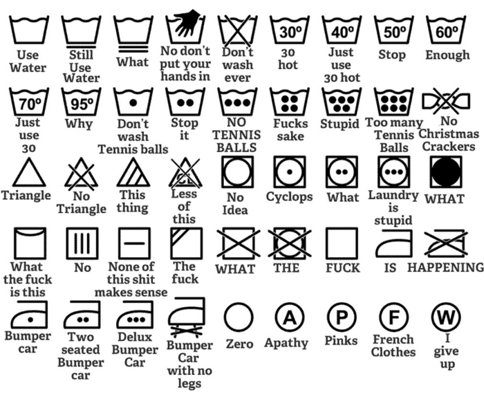
http://thomasbyttebier.be/blog/the-best-icon-is-a-text-label
#design #icon
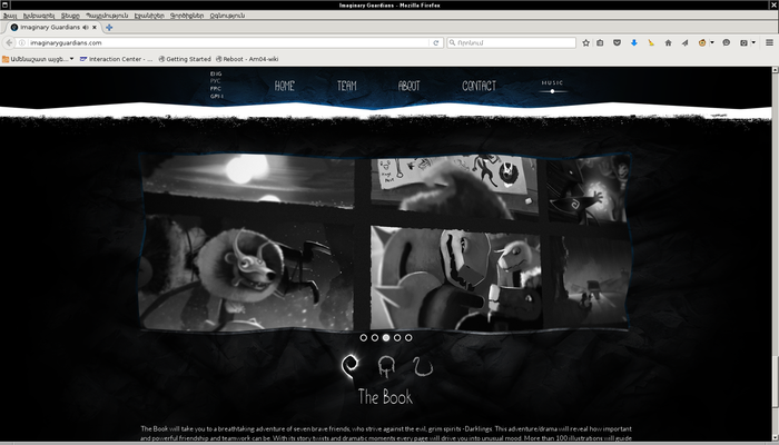
proud to present this project http://imaginaryguardians.com/ i know some people in the crew. (:
well, I even wonder how is it possible? i do not know anyone. (:
#book #game #music #site #web #screenshot #project #graphics #design #illustration
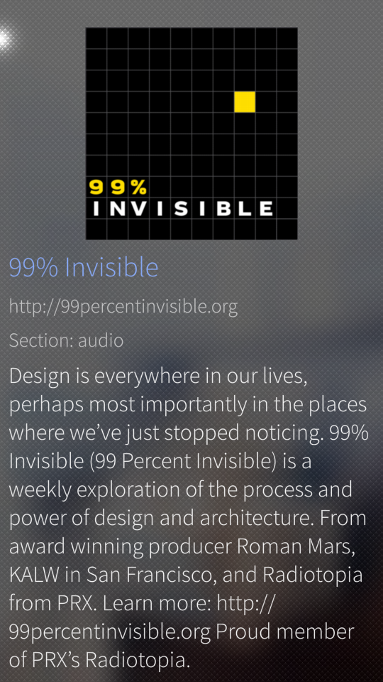
found interesting podcast. there is for exampre an episode, about emergence of hashtags. (:
#podcast #design #architecture
It is often said that the government is not able to use money/resources efficiently. As efficient as private entrepreneurs can. Well, I agree.
However recently I’ve seen a couple of proprietary software projects, which were closed by the authors. You cannot download the mobile application. There is no website. It’s over.
And I have thought about community projects, collaborative projects. It looks like sometimes community projects can be even more efficient, because(if) they have no(limited) means to earn money. They decrease expenses as much as possible, and design software accordingly. And they can be more sustainable, though they have no income. Of course it depends on the community size. Number of speakers of the technology. (:
An example? Consider failed social network start-up. Now consider Diaspora. Social network start-up had to pay a lot for servers and infrastructure. Keep a space, and developers. Diaspora is hosted in different places, even on cheap one board computers. That’s about design and efficiency. Of course it has problems, and the development is not that fast as desirable. But the project is very efficient in some aspects.
#design #efficiency #free_software #software #diaspora #social_network #web #freedom #technology #sustainability
when the file gets overwritten, how different file systems handle that?
do they mark the old file as erased and create a new file or rather try to write the information to the same inodes? then what if there’s no space and the new file has bigger size? I guess it’s better to try to create a new file, in case of filesystems which avoid fragmentation.
in other words, is the probability to recover overwritten file smaller, than probability to recover erased file?
#filesystem #forensics #question #operating_systems #design

this Azerbaijani poster is better made. (: more expressive than the previous one.
#design #socute #artsakh #nkpeace
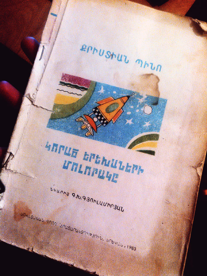
planet of the lost children
#sci-fi #book #design #cover #spaceship

I use noscript thus I see Georgian letters instead of some graphics for some reason. (:
#gif #georgian_alphabet #letters #design #web
A striking example of this phenomenon has recently been provided by Ada. If Ada is going to provide a standard, that standard had better be unambiguously documented. At least two groups have had a go at it; both efforts resulted in formal texts of about 600 pages, i.e. many times longer than needed to ensure the impossibility of ever establishing firmly that the two documents define the same programming language. The fault of the patent unmanageability of these two documents lies neither with the two groups that composed them, nor with the formalisms they have adopted, but entirely with the language itself: only by not providing a formal definition themselves, could its designers hide that they were proposing an unmanageable monstrum. That Ada will decrease the pain of programming and increase the trustworthiness of our designs to within acceptable limits is one of those fictions for which a military education is needed in order to believe in it.
#ada #programming #dod #design #programming_languages #programming #dijkstra
— the most advanced model of interaction for different programs is COM. — and in linux world, it’s not used any more. — because gnome devs decided to write for those “who don’t understand anything”, and people become similar to those they are writing for.
#gnome #com #linux #corba #technology #design
iTunes is pretty much a galaxy unto itself these days and is in danger of collapsing into a black hole. Time to split it out.
this post has interesting ideas, for example it suggests have a human readable (let’s say json like) interface for different tools (instead of applications) to communicate with each other, and separate, let’s say, email client functionality by modules - service which receives emails, tool to view the list of emails, tool to view an exact email, and every module can be changed without affecting the other.
#itunes #applications #galaxy #black_hole #design #interface
canon eos film camera, when you put a roll of film inside, rewinds it from the roll first, and then, moves it in the opposite (to the common) direction, which means, that part of the film you have already shot goes inside the roll. thus if you accidentally open the camera, only unexposed part of the film will see the light. your shots are safe inside the roll.
#design #idea #canon #eos #canon_eos #film #film_photography #photography
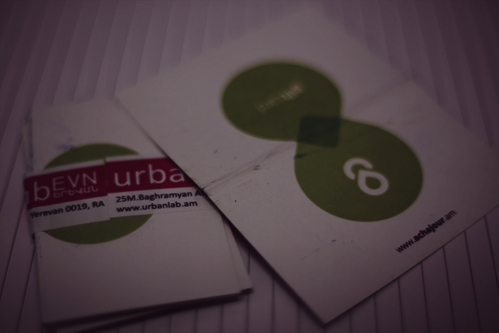
designer from the UrbanLab who was engaged in creation of Ucom! ISP pavilion at digitec exhibition wanted it also to have some retro staff. He contacted me, and we have chosen Atari from my retro collection. He asked how much money do I want for the rent. Of course I refused to be paid.
Yesterday he did return my Atari and brought a present - Achajour cafe gift cards. (:
#yerevan #digitec #urbanlab #ucom #isp #pavilion #design #achajour #atari #atari_st #retro #retro_computing
it turned out, rangefinder photo cameras have huge limitations.
#photography #rangefinder #camera #cameras #photo #lens #lenses #design
I woudl like to quote this post, instead of resharing because I don’t agree with everything there. I don’t think we have to forget our native languages, that’s why comparison to the switch from facebook to diaspora, which was made there seems deeply not right to me. I personally value my language, and it doesn’t make me feel good when I acknowledge threats it has.
Also, I have to say that I also fear simplicity in design. Simplicity can mean gaining flexibility and expressiveness, like in case with Oberon operating system and language, and it can mean something like Newlang, the language which was simple but was designed in order to rule those people.
Simplicity can also mean “don’t know what pointer is” which, I believe is wrong, because every programmer should know what pointer is. Simplicity can mean making phonemic orthography, and I am opponent of that. That approach, taken by communists, in my opinion, damaged Armenian orthography and language.
So I believe, simplicity does not always mean good design. However, good design is very often simple. Now the quote.
English vs. Esperanto:
English:
You sang nicely, AND You have sung nicely, AND You had sung nicely, AND You did sing nicely , AND You did use to sing nicely, AND You were singing nicely, AND You used to sing nicely.
Esperanto:
#esperanto #design #simplicity #comparison #english #orthography #phonemic_orthography #language #armenian #oberon #programming #pointer #flexibility #expressiveness
Problems I have with new Sailfish interface are
— I am not sure it’s a great design decision to show time and battery information all the time. first Sailfish screen was unique in that it did not.
Time did not eat space of your home screen. It was just a “swipe away”, as they say. Because screen had space outside the phone screen. It was more like workspaces. And now sailfish home screen is more similar to any other mobile os. Congratulations, you became “just like everybody” in that regard.
— Swiping left or right to get notifications screen, yes, it’s more like Harmattan, but it makes me feel that constraints. For example, maemo interface with workspaces gave me feeling of space. In Sailfish I feel constrained. Walls, limits. No space. May be too personal. I believe getting notifications by swiping from down to up was much better idea.
— It was possible to access shortcuts (Sperrbildschirm) when the phone is not locked. Now I have to lock it and only then I can get them. It means I get my flashlight much slower than previously.
— there is no “ton an” in those settings anymore. It was there by default.
Now I did not find a way to put the system to the silent mode. I had to choose separately: no sounds for emails, for chat messages, etc. What if I want to turn all sounds on and off without going in to details every time? And it requires to go to the settings application for that. May be I just don’t orient in interfaces well, I suppose I am.
— Covers don’t work any more. May be only for me or may be I am doing something the wrong way. When I press the cover in order to move it left or right, then the whole screen moves and it can go to the notifications area. Previously if I have let’s say email application running, I could use cover action to start a new email, and if it was “notes” application I could use action in order to create new note. It was possible to stop/start players like that. I don’t know why this essential feature does not work.
— locking the device requires two gestures now. First swipe from upside down, then choose lock. Previously it was, I believe more consistent - swiping like that on an app would close it, swiping on home screen would lock it.
— less ambience?
I liked that when you got application’s icons screen first, you would still have some ambience, and only on second or third screen ambience would not be noticeable. I like the ambience idea a lot. Now I have a feeling it’s more like android, when apps don’t feel that ambience. And they are not that alive because I cannot use cover actions.
I believe it’s not about interface change. I am used to many different interfaces. It’s more about design decisions, and I feel now it looks more like regular mobile os interface, less unique.
I like some things too: Effects are not my favourite thing, but probably fade in with vignetting during unlock is a good decision, many will like it. Good decision is to change sizes of running application’s windows at some events.
#sailfish #interface #update #jolla #ambience #ux #user-experience #home #design

modular pc by acer
http://www.engadget.com/2015/09/02/acer-revo-build-modular-pc/
#pc #design
if you want to make something, what you do, good, then may be you should not sometimes do that.
there are people, be they acquaintances, business or relationship partners, who don’t understand, don’t value, don’t appreciate the way we do that. and we do that that way in order to make something good, to make good work, to make things better.
well, they may need something else. does it make sense to make what they want if that’s not good? i don’t think so.
i don’t want to endeavour for something i won’t like after all. no, it’s better to make something good and don’t waist time.
#makers #design #good #taste #business #relationships #people #freedom

The way they write functional programs for decidedly non-functional problems is through a trick called a monad, which I will not explain and nobody understands anyway, but the point is, in the hands of a very clever programmer, functional programming “can” be used in many more places than you would naively expect.
And that is really the problem. It works at first and then it keeps working until suddenly it doesn’t. And this
communismfunctionalism spreads ideologically until yourcountrycodebase is saddled with debt and nobody can bail you out because you have a lot of monads and nobody can understand them.
#structs #classes #functional_programming #imperative_programming #programming #monads #apple #siwft #programming_languages #software #development #design
When module stays loaded and can be manipulated from the “shell” by calling so called commands, i. e. exported functions of that module. That’s very beautiful design, I believe.
https://www.youtube.com/watch?v=byC98PHZR2Y
#oberon #operating_systems #programming #draw #demo #shell #tui #interface #design
Did you notice, that brand name written on the back of Nokia (at least n900) and Jolla isn’t loud, flashy, blatant? On Samsung devices it’s silver, it shines, and no way someone won’t notice which device you’re holding. In case of n900 and Jolla, brand name is slightly carved, and doesn’t make much noise, does not show off. Which I personally like a lot.
#europe #design #marketing #nokia #jolla #branding #advertisement #brand #taste #taste_for_makers
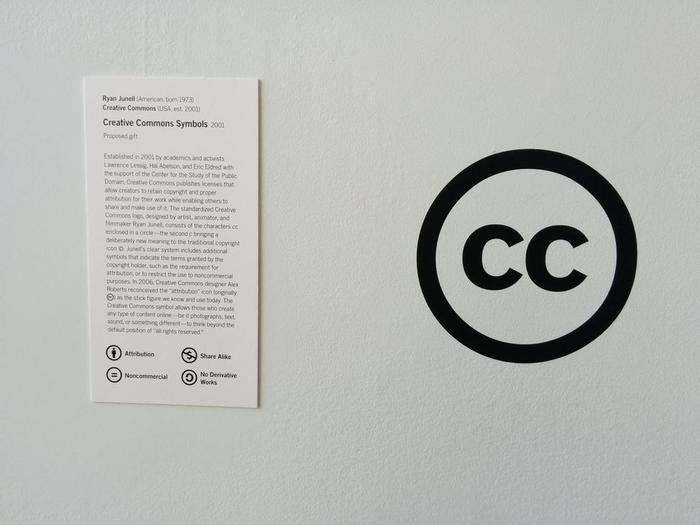
#creative-commons #moma #design source
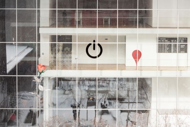
power symbol, location icon and creative commons at moma.
#design #moma #location #icon #creative-commons #license #marker
So it’s out, it’s commercially produced, it’s available. Not as outstanding as Sailfish for me, it’s more like Android, with the always present bar at the top, but still, it’s a full fledged GNU/Linux operating system. Graphics seems to be smooth, probably that’s because of Mir, on the other hand, I miss pidgin IM on Jolla, so I would like to have more banal X with GTK-2 software porting possibility. Whatever, see
BQ Aquaris E4.5 Ubuntu phone review and demo + additional thoughts
https://www.youtube.com/watch?v=CR4baLQmU0s
#ubuntu #ubuntu-phone #linux #gnu #gnu-linux #aquaris #review #demo #unix #qml #qt #interface #design #software
critics of go http://dtrace.org/blogs/wesolows/2014/12/29/golang-is-trash/
#critics #golang #google-go #go #programming #programming-languages #plan9 #assembler #language #design
the Mamiya lenses are rated as being just about the sharpest lenses ever made for a 120 camera. The Pentacon lenses, on the other hand, even the CZJ multifoated ones, are adequate at best, and awful at worst(in the case of a lot of the Russian lenses). That’s optical quality. When you look at mechanical quality, you are comparing one of the best examples of Japanese design and engineering, to one the eastern bloc’s best examples of design and engineering.
http://photo.net/medium-format-photography-forum/00BJON
#lenses #mamiya #pentacon #photography #design #engineering
#blackberry #Z3 has #Nokia #N9 like #design and #Jolla #Sailfish like home screen.
https://www.youtube.com/watch?v=jILgxeNBK_8
I wonder is decentralization sustainable by design?
#decentralization #diaspora #friendica #identica #design #sustainability #game-theory #mathematics
Sweden Sans: designers create national font http://www.theguardian.com/world/2014/nov/14/sweden-sans-designers-create-national-font #design #font #sweden
already 7 million views http://www.youtube.com/watch?v=znK652H6yQM
#apple #test #iphone #video #quality #design
the belief is wide-spread that programming is easy, can be learned on the job, and does not require specific training or talent. However, it is not programming in the sense of coding that is the problem, but design. Applications have become very demanding and their tasks complex. Mastering this growing complexity is the primary challenge. To tackle this task requires experience and an explicit ability for abstraction on many levels. It is difficult to learn this, and even more so to teach it. Not every programmer is a born designer.
https://www.simple-talk.com/opinion/geek-of-the-week/niklaus-wirth-geek-of-the-week/
#programming #wirth #design

aaaaa~ such a cool art project: “The NEURO project is a clue to what the euro can look like.” - this is the one i like (:
#euro #art #project #art-project #neuro #money #dog #canary #canary-islands #10€ #dogs #europe #eu #european-union #design
#Tanenbaum presenting #minix3, suggests to kill the #driver and shows how #minix restarts the driver.
http://www.youtube.com/watch?v=vlOsy0PZZyc
also https://archive.fosdem.org/2014/schedule/event/minix_3_on_arm/
btw, everybody is invited to his farewell party http://www.cs.vu.nl/~ast/afscheid/index.php in October #23 at Vrije.
#operating-systems #microkernel #posix #video #arm #beagle-board #design
story about drinking milk.
http://www.youtube.com/watch?v=lsLXQEeLiI0
found accidentally, when i was lurking through old videos.
while searching for it on youtube i also found this, this and may be this worth watching.
#game #games #conspiracy #conspiracy-theory #video #graphics #3d #animation #trailer #design ############
and yes, I haven’t seen any games almost, except old arcades, limbo and machinarium.
I have uploaded some historical photos of computers and devices designed in Armenia with some descriptions http://norayr.arnet.am/RetroComputing/Armenian/photos/index.html
#computer #armenia #yerevan #mergelian #history #computers #retro #retro-computers #vintage #historical #technologies #information-technologies #masis #razdan #nairi #nairi-3 #nairi-4 #pgp #memory #tape #digital #computing #techno #Informatica #photos #photo #design
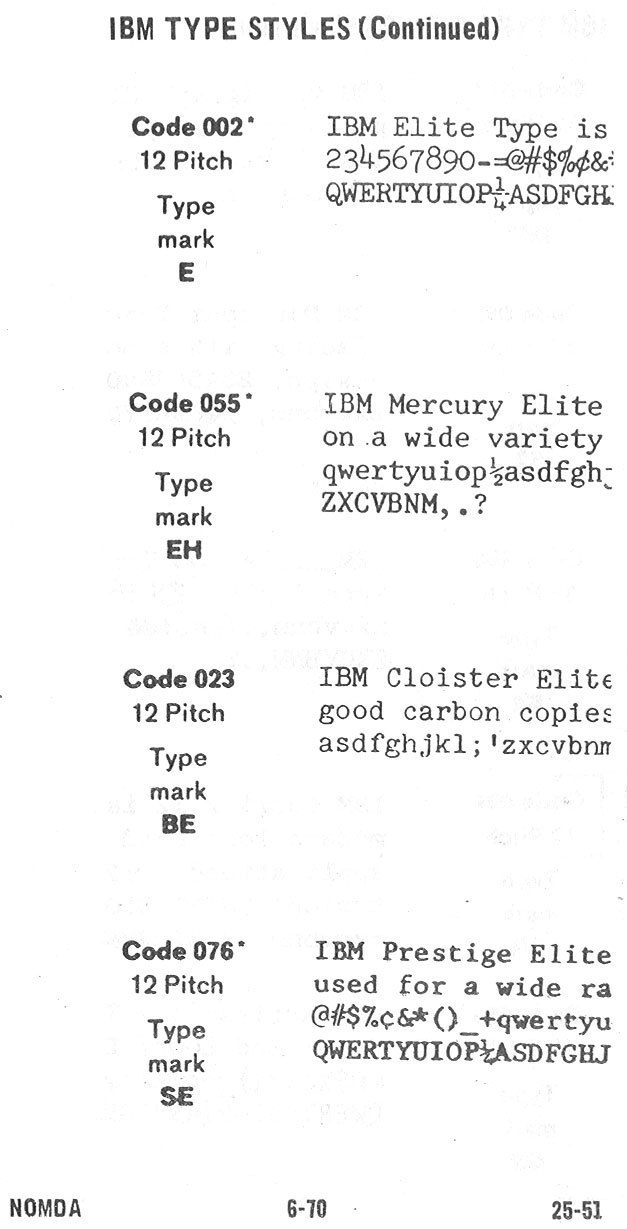
1964 NOMDA Blue Book: IBM Font Styles
http://munk.org/typecast/2011/04/25/1964-nomda-blue-book-ibm-font-styles/
#ibm #font #fonts #1964 #typeface #typewriter #typography #letter #alphabet #book #style #design
open source linux compatible hardware for 22 euro
github page
#linux #hardware #open-source #board #olimex #programming #design
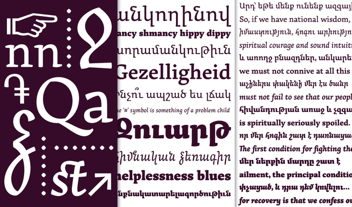
հենց այս տառատեսակն է օգտագործւում է «Երեւան» ամսագրում։ ։Ճ
Հարցազրոյց Խաժակ Աբելեանի հետ / Interview with Khajag Apelian
Type Design Is Not Only About Drawing Letters
#yerevan #yerevan-magazine #arek #font #typography #typface #design #interview #armenian #arab #latin #script #alphabet #letters #Երեւան #Երեւան֊ամսագիր #արեգ #տառատեսակ #ֆոնտ #հրատարակչութիւն #հարցազրոյց #հայերէն #արաբերէն #լատիներէն #գիր #այբուբեն #տառ

կարծես թէ սա է լինելու այս տարւա բարքեմփի լոգոն։
Մենք միշտ էլ ուզում էինք որ այն չլինի գլոբալիստական, որ երեւա, Երեւանի բարքեմփն է, ոչ թէ ասենք Տւերի կամ Գիւտերսլո֊ի։ Աւաղ, յաճախ «հայկականը» փորձում են շեշտել օգտագործելով նուռ/ծիրան/մոլիբդեն/կաուչուկ, բայց դա ազգագրական է, ոչ ազգային։ Իսկ Զւարթնոցը եւ ազգային ճարտարապետութեան միջազգային կարեւորութեան նմուշ է, եւ տեխնո է, եւ ֆուտուրիստիկ է, արդի է եւ ինքը հենց EVN օդանաւակայանն է, EVN֊ն է։
#barcamp #yerevan #zvartnots #airport #logo #design #2014 #բարքեմփ #երեւան #զվարթնոց #զուարթնոց #զւարթնոց #դիզայն #օդանավակայան #օդանաւակայան #EVN #barcampevn14 #barcampevn2014 ###############
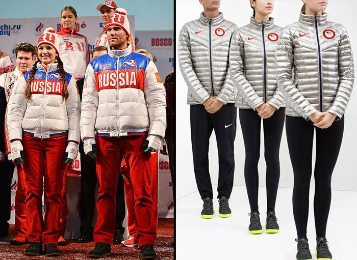
Ձեւը որոշում է բովանդակութիւնը։ (form defines content)
http://echo.msk.ru/blog/adagamov/1227376-echo/
#russia #usa #design #olympic-games #taste #uniform #form #content #ռուսաստան #ամն #դիզայն #ձեւ #բովանդակութիւն #ճաշակ
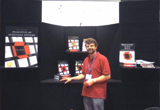
Brian L. Stuart home contains some pages from the Principles of Operating Systems: Design & Applications, a book, which in particular explores design of Inferno operating system.
http://umdrive.memphis.edu/blstuart/htdocs/index.html
#operating-systems #plan9 #inferno #unix #programming #limbo #design
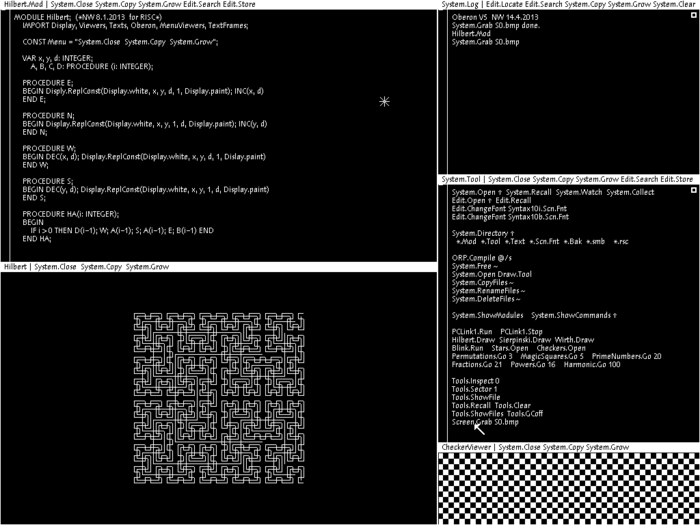
New edition of Wirth’s book Project Oberon is out. It describes not only built from scratch software(entire operating system and compiler), but design of the hardware as well.
The vast complexity of popular operating systems makes them not only obscure, but also provides opportunities for “back doors”. They allow external agents to introduce spies and devils unnoticed by the user, making the system attackable and corruptible. The only safe remedy is to build a safe system anew from scratch.
http://www.inf.ethz.ch/personal/wirth/ProjectOberon/index.html
#oberon #wirth #niklaus-wirth #risc #programming #fpga #books #programming-languages #compilers #operating-systems #compiler #freedom #design #security #privacy #surveillance #reliability
in response to an assertion by mr john carmack who is wrong (:
http://www.youtube.com/watch?v=pI4IYRT-Msw
#oberon #render #3d #design #programming #graphics
http://www.youtube.com/watch?v=oDAw7vW7H0c
http://www.engadget.com/2013/09/11/phonebloks/#continued
#mobile #phone #smartphone #gadget #module #design #electronics #crowdfunding #ecology #phonebloks #consume #waste #freedom

Your Lifestyle Has Already Been Designed
The ultimate tool for corporations to sustain a culture of this sort is to develop the 40-hour workweek as the normal lifestyle. Under these working conditions people have to build a life in the evenings and on weekends. This arrangement makes us naturally more inclined to spend heavily on entertainment and conveniences because our free time is so scarce.
I’ve only been back at work for a few days, but already I’m noticing that the more wholesome activities are quickly dropping out of my life: walking, exercising, reading, meditating, and extra writing.
The one conspicuous similarity between these activities is that they cost little or no money, but they take time.
http://www.raptitude.com/2010/07/your-lifestyle-has-already-been-designed/
#lifestyle #consume #obey #consumership #travel #manipulation #corporations #canada #buying #game #time #style #reading #walking #writing #activities #job #work #design
https://www.youtube.com/watch?v=TzN-uIVkfjg
@{Ագնես Խենթունի (Agnes N{u|e}tter) ; satenik@spyurk.am} @{Իմանդես Իմաստասեր (Imandes) ; imandes@spyurk.am} մենք այդ մասին խոսացել ենք ու վաղուց ուզում էի ձեր հետ կիսվել այս խոսքով։
#cute #sexy #sweet #funny #ted #talk #reward #evolution #design #taste
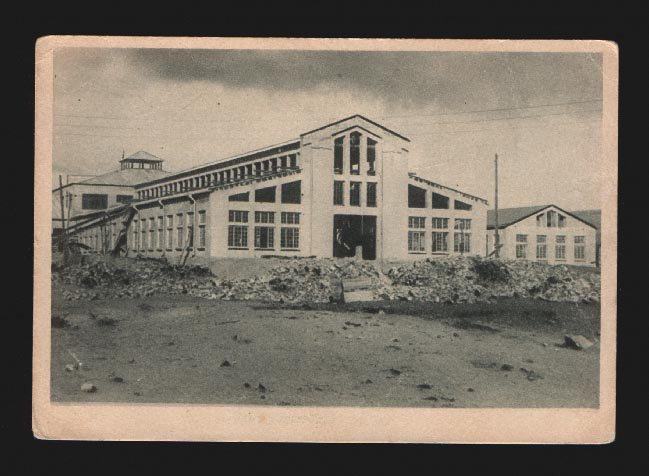
Yet another great example of #industrial #architecture in #Yerevan - The Mechanical #Factory. I don’t yet have exact details on the architect and the date of construction, but I’m looking. What is interesting about this building is the fact that the architect is obviously referencing the three-tier #basilicas in his #design Արդյունաբերական ճարտարապետության մեկ ուրիշ հրաշալի օրինակ Երևանում - Մեխանիկական գործարանը: Առայժմս մանրամասներ չունեմ շենքի կառուցման և ճարտարապետի հետ կապված, բայց ման եմ գալիս… Հետաքրքիր է որ ճարտարապետը բացահայտորեն մեկնարկում է #բազիլիկ տիպի եկեղեցիներին իր դիզայնի մեջ…
http://show-shenk.livejournal.com/47322.html
#Երեւան #ճարտարապետություն #պատություն #շենք #հայաստան #քաղաք #գործարան #արդյունաբերություն #architecture #Yerevan
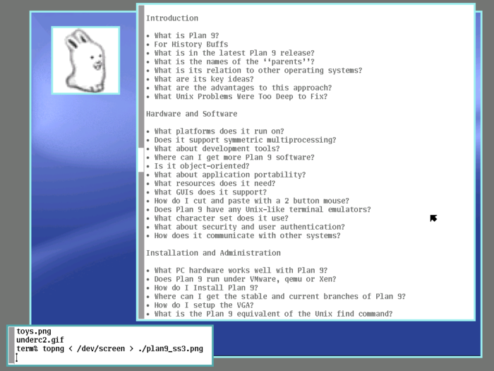
I guess today #bunny is trendy topic. That’s why I have yet another opportunity to remind about interesting #project, good #design. #plan9 #plan-9 #glenda
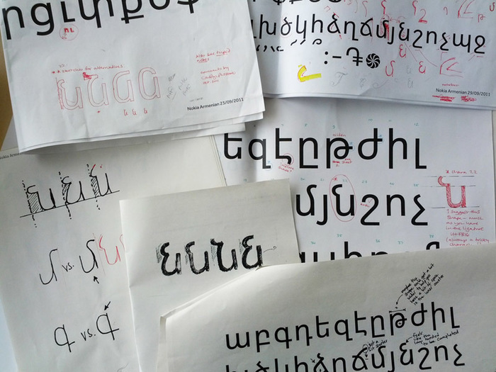
#nokia #pure : Answering the Challenge of #Armenian http://nokiapureblog.daltonmaag.com/2012/06/answering-challenge-of-armenian.html
The nature of the script brings interesting challenges for designers. A strong feature of the script is the frequent repetition in the uppercase and lowercase of shapes like the u, o, n, and m. These shapes create quite a rigid texture, so spacing and the right proportions are crucial for the design of the Armenian.
#design #font #տառատեսակ #դիզայն #նախագծում #նոկիա #հայերեն

նայվո՞ւմ ա
այստեղից
#դրոշ #flag #design #armenian
Я не знаю #ООП http://habrahabr.ru/post/147927/ #ծրագրավորում #programming #նախագծում #design #oop
#Intelligent #Design is #Stupid: Neil deGrasse Tyson http://www.youtube.com/watch?v=oEl9kVl6KPc via @{23dornot23d@diasp.org ; 23dornot23d@diasp.org} #nature #science #talk