Problems I have with new Sailfish interface are
— I am not sure it’s a great design decision to show time and battery information all the time. first Sailfish screen was unique in that it did not.
Time did not eat space of your home screen. It was just a “swipe away”, as they say. Because screen had space outside the phone screen. It was more like workspaces. And now sailfish home screen is more similar to any other mobile os. Congratulations, you became “just like everybody” in that regard.
— Swiping left or right to get notifications screen, yes, it’s more like Harmattan, but it makes me feel that constraints. For example, maemo interface with workspaces gave me feeling of space. In Sailfish I feel constrained. Walls, limits. No space. May be too personal. I believe getting notifications by swiping from down to up was much better idea.
— It was possible to access shortcuts (Sperrbildschirm) when the phone is not locked. Now I have to lock it and only then I can get them. It means I get my flashlight much slower than previously.
— there is no “ton an” in those settings anymore. It was there by default.
Now I did not find a way to put the system to the silent mode. I had to choose separately: no sounds for emails, for chat messages, etc. What if I want to turn all sounds on and off without going in to details every time? And it requires to go to the settings application for that. May be I just don’t orient in interfaces well, I suppose I am.
— Covers don’t work any more. May be only for me or may be I am doing something the wrong way. When I press the cover in order to move it left or right, then the whole screen moves and it can go to the notifications area. Previously if I have let’s say email application running, I could use cover action to start a new email, and if it was “notes” application I could use action in order to create new note. It was possible to stop/start players like that. I don’t know why this essential feature does not work.
— locking the device requires two gestures now. First swipe from upside down, then choose lock. Previously it was, I believe more consistent - swiping like that on an app would close it, swiping on home screen would lock it.
— less ambience?
I liked that when you got application’s icons screen first, you would still have some ambience, and only on second or third screen ambience would not be noticeable. I like the ambience idea a lot. Now I have a feeling it’s more like android, when apps don’t feel that ambience. And they are not that alive because I cannot use cover actions.
I believe it’s not about interface change. I am used to many different interfaces. It’s more about design decisions, and I feel now it looks more like regular mobile os interface, less unique.
I like some things too: Effects are not my favourite thing, but probably fade in with vignetting during unlock is a good decision, many will like it. Good decision is to change sizes of running application’s windows at some events.
#sailfish #interface #update #jolla #ambience #ux #user-experience #home #design

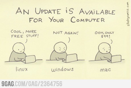
#update #windows #mac #microsoft #apple #linux #gnu #updates #os