
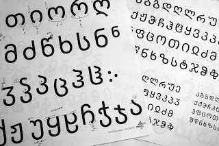
Gorgeous #Georgian for #Nokia #Pure http://nokiapureblog.daltonmaag.com/2012/05/gorgeous-georgian-for-nokia-pure.html The Georgian #alphabet differs considerably from the #Latin alphabet. Latin #typefaces have an x-height, which is, as the name suggests, the area in a typeface that is the height of a lowercase x. This is the area in which most of the visual information is concentrated, and that makes the #letters readable. In #Nokia-Pure we have purposefully enlarged the x-height to aid readability. In Georgian there is no equivalent of an x-height; it is the middle portion of the letter that has most of the visual information. We had to create entirely different #proportions to deal with this #script, but maintain the look and feel of the Latin #font.
#նախագիծ #տառատեսակ #վրացերեն #georgia